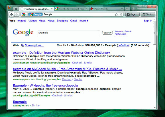
I think Mozilla is currently in competition with WordPress in releasing updates. Its not been so long we have installed Firefox 3.5 and hacked old Firefox Addons, the team is already looking forward to the big one, Firefox 4.0. Mozilla Wiki has released screenshots of the Firefox 4 and it looks pretty awesome considering the view area available for browsing.
This time they are releasing in two versions (or may be they finalize one during release or both of them would come with browser and it becomes choice of user to stick on to one, nothing is clear) and a cool appearance and functionality modification at the address bar. If you look into the screenshots, you will find them very attractive compared with current version of FF.


Both the above screenshots show that the latest version of Firefox will not have the traditional menu bar and they seem to be minimized into a single button. The version A (above) still has a title bar, but they have done a wonderful job with version B by removing Firefox title bar. Both of them has one new button straight to tabs (observe 4 small squares arranged like a 2×2 square table) which is little confusing and no explanation has been given yet. The address bar has been added with cool features which favors those who migrate from IE to FF, may be confusing for FF addicts ![]() . The image below is self explanatory about the changes in the address bar.
. The image below is self explanatory about the changes in the address bar.

They themselves listed few advantages and disadvantages with this and lets go into few of them.
The main advantage with this type of change is that it favors users on widescreen displays as their vertical viewing area is normally smaller. This is the reason I was using Hide Caption FF addon to get rid of useless title bar which is disappeared in the version B here.
Even with this arrangement, I see disadvantages with both versions - keeping tabs above increases the distance you move the mouse to switch the tabs and keeping them below as in other version will display title bar which is of course not needed. One more disadvantage is while using FF with StumbleUpon, FF should also consider SU which has a huge community while designing. Keeping the tabs above the address bar might push stumble upon below address bar, so it includes a number of buttons between the reader area and tab switcher, if by mistake we click on anything while working on something, our recent unsaved changes might be lost.
Addiction: We are all addicted to click File > Save As or Print or New Tab - type using which requires 2 clicks and with this arrangement where we need to navigate using Page > File > Save As or Print will require 2 clicks and 1 mouseover which is bit lengthy process and also has chances that hovering the mouse on other navigation options take some time in between. If time is not the factor, the confusion is to be considered. Its advised to remember keyboard shortcuts for most frequently used operations.
Though at first, we can point out many disadvantages, anyone can familiarize them in times. We just need to wait for the release.
Source: mozilla wiki
No comments:
Post a Comment